

Posted by Editorial Team
on October 28, 2026

Last Updated: October 27, 2026
Quick Summary
The best seasonal color palettes for family portraits coordinate with the setting rather than match exactly. Choose three or four colors that contrast with the dominant background, let most people wear a neutral base, and use one or two accents. Spring favors pastels and cream, summer favors light neutrals, fall favors rust, cream, and navy, and winter favors rich deep tones.
- Lock the two or three dominant background colors before choosing outfits.
- Assign roles: base 50-60%, secondary 25-35%, accent 10-15%.
- Build a physical swatch card and check colors in daylight before buying.
- Lay all outfits out and photograph them to catch clashing pieces.
- Limit patterns and logos to one or two people to keep focus on faces.
Table of Contents
- Why Seasonal Color Palettes Matter for Family Portraits
- Building a Family Palette Step by Step
- Spring Family Photo Outfits: Soft Pastels and Fresh Greens
- Summer Palettes: Light Neutrals and Bright Accents
- Fall Family Photo Color Schemes: Rust, Cream, and Navy
- Winter Family Photo Outfits: Rich Tones and Cozy Textures
- Coordinating Family Outfits for Pictures Without Matching Exactly
- Planning Your Family Palette and Shopping With Confidence
- Frequently Asked Questions
Why Seasonal Color Palettes Matter for Family Portraits
Choosing the right seasonal color palettes is often the difference between a family photo that looks timeless and one that looks dated. Colors that suit the season help the family blend with the scenery instead of fighting it.
A seasonal palette works because the background does much of the work. Green grass, bare trees, golden leaves, and gray winter skies all shape how clothing colors appear on camera. Many photographers suggest that families coordinate with the setting rather than match one another exactly.
Here is the core idea. Pick a short list of colors that fit the season, then let each person wear one or two of them. This approach keeps the photo cohesive without making everyone look like they came from the same shopping trip.
- Seasonal palettes complement natural light and outdoor backdrops
- Coordinated colors look more intentional than identical outfits
- A limited palette keeps the eye on faces, not clothing
Building a Family Palette Step by Step
Most guides stop at "pick three colors." The harder part is distributing those colors across four to eight people so the group reads as one unit without anyone disappearing into the background or dominating the frame. Use this repeatable method.
Step 1: Lock the setting and its dominant background colors. Stand where the photographer will stand and list the two or three colors that fill most of the frame, green grass and trees, rust and gold foliage, sand and surf, snow and gray sky, or a brick or painted indoor wall. Your palette has to contrast with those colors, not echo them. A sage-green dress against a wall of green shrubs will vanish; the same dress against rust leaves will pop.
Step 2: Choose a lead outfit, not a lead color. Pick the one person whose outfit you already love, often a parent or the child with the strongest opinion, and treat that garment as the anchor. Pull its two or three dominant colors out and write them down.
Step 3: Assign roles, not just colors. Give each palette color a job:
- Base (50-60% of the group): cream, tan, oatmeal, soft gray, or navy. This is the color most people wear, and it keeps the frame calm.
- Secondary (25-35%): sage, rust, dusty blue, or burgundy. Two or three people wear this to create depth.
- Accent (10-15%): one bold piece, a coral scarf, a mustard cardigan, a patterned shirt, on one or two people only.
A family of five might run three base outfits, one secondary, and one accent. A family of eight might run four base, three secondary, and one accent. The ratio matters more than the exact headcount.
Step 4: Build a physical swatch card before you buy. Paint chips from a hardware store are free and more accurate than phone screens. Tape three to five chips to an index card, label each with its role (base, secondary, accent), and carry it shopping.
Step 5: Lay everything out together and photograph it. Before the session, spread all outfits on a bed or floor and take a phone photo in daylight. Squint at the photo.
Step 6: Test against skin tones and comfort needs. Hold each person's assigned color near their face in daylight. If a family member hates a color or refuses a fabric, move them to a base neutral, the palette still holds.
Pro Tip
Build the palette around the person who is hardest to dress, often a teenager or a toddler with strong preferences, and let everyone else flex around them. It is easier to move four cooperative people than to force one reluctant one.
A common mistake is choosing too many bright colors or assigning every person a different shade. Stick to three to four colors total, give most of the group a base neutral, and let one or two accents do the work. That is what makes a group photo look intentional rather than accidental.
The six steps break down into concrete actions and checkpoints, summarised below.
| Step | What to do | Time or frequency |
|---|---|---|
| 1. Lock the setting | List two or three dominant background colors | Before shopping |
| 2. Choose a lead outfit | Pull two or three colors from the anchor garment | Once |
| 3. Assign roles | Base 50-60%, secondary 25-35%, accent 10-15% | Per group size |
| 4. Build a swatch card | Hold chips against garments in daylight | Before buying |
| 5. Lay out and photograph | Check the group as one image | Two minutes before session |
| 6. Test skin tones and comfort | Hold colors near faces in daylight | Per person |
Spring Family Photo Outfits: Soft Pastels and Fresh Greens
Spring palettes lean lighter and softer. Pastel tones such as light pink, pale yellow, and soft blue pair well with fresh green grass and blooming trees.
Many spring photoshoots look best with these colors:
- Cream and white as a base
- Sage green or muted green as an accent
- Light pink or light purple for a soft pop
- Denim or soft blue for contrast
Avoid pure neon tones. They compete with the natural greens of the scenery and can look harsh in outdoor light.
Summer Palettes: Light Neutrals and Bright Accents
Summer photos often happen outdoors in strong sunlight. Light neutrals reflect that light well and keep faces bright and clear.
Try building a summer palette around:
- Light neutrals like white, oatmeal, and pale tan
- One bold accent such as a cobalt blue or coral
- Breathable fabrics that move naturally in a breeze
Bright accents work best when they appear on only one or two people. If every family member wears a bright color, the photo can look busy. Balance one bright piece with softer tones on the others.
Fall Family Photo Color Schemes: Rust, Cream, and Navy
Fall offers some of the most flattering color options for family portraits. Warm browns, tans, and rust tones match turning leaves and golden light.
Legacy Plaid Swaetshirt (Unisex) →
A reliable fall scheme includes:
- Rust or terracotta for warmth
- Cream as a soft, bright base
- Navy blue for depth and a grounded look
- Burgundy or cranberry for a richer accent
These colors blend well with autumn foliage. Navy works especially well as an anchor, since it balances the warmth of the rust and cream. Burgundy adds visual interest without pulling focus from the family.
Winter Family Photo Outfits: Rich Tones and Cozy Textures
Winter palettes can feel moodier and more dramatic. Rich tones like deep green, burgundy, navy, and charcoal stand out against snow or gray skies.
Texture matters more in winter. Plaid works well when one or two pieces carry the pattern and the rest of the outfit stays solid.
For winter photos:
- Choose deep, rich colors that read well in lower light
- Mix one textured piece with solid pieces
- Layer thoughtfully, but keep the outfits easy to see
Coordinating Family Outfits for Pictures Without Matching Exactly
"Coordinate, don't match" is the most repeated line in family-photo advice, and the least explained. For more examples, see best matching family outfits for photos.
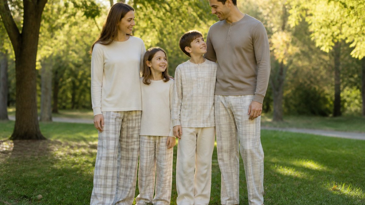
Start with a shared color story, not a shared outfit. Pick one dominant color that appears on most people, cream, navy, tan, or soft gray, and let each person wear it in a different garment: a cream sweater, a tan button-down, a cream dress, tan chinos. Same color family, different pieces.
Build for varied skin tones. A palette that flatters one family member can wash out another. A practical approach is to keep the base neutral identical across the group and let each person's secondary color shift toward what suits them:
- Cool undertones (pink, blue, or olive-leaning): navy, sage, dusty blue, burgundy, cream.
- Warm undertones (golden, peachy, or yellow-leaning): rust, terracotta, mustard, olive, warm tan.
- Neutral undertones: most muted shades work; avoid neon and stark pure white near the face.
If two family members have opposite undertones, put them both in the same base neutral (cream or navy flatters almost everyone) and give each a different secondary. The group still reads as one palette.
Handle comfort and sensory needs. A child who hates tags, wool, or tight waistbands will show discomfort in every frame. Let that person wear their most comfortable solid-color piece in a base or secondary shade and build the rest of the group around it.
Limit patterns and logos. Patterns add depth but multiply fast. Keep prints to one or two people, and choose small, muted prints over large or high-contrast ones. For stylish alternatives to cheesy matching family sets, look beyond themed outfits.
Watch for colors that blend into the background. Sage green against green foliage, tan against sand, and gray against an overcast sky all cause people to disappear at the edges of the frame. Check each assigned color against the setting from Step 1 and swap any piece that matches the backdrop too closely.
Vary texture to add depth.
Watch Out
The most common coordination failure is not too few colors, it is too many competing patterns plus one bright accent plus a busy background. Pick two of those three, never all three.
Check the group together before the session. Lay out every outfit, photograph them in daylight, and look at the image as a whole. If one person's outfit is the first thing you notice, that is the piece to change. The goal is a photo where the viewer sees faces first and color second.
Planning Your Family Palette and Shopping With Confidence
Before you shop, write down your location, season, and three to four colors. Bring that list with you so every piece you buy fits the same plan.
When you are ready to buy, consider these options from Coordinates:
- Christmas Legacy Plaid Top (Women's) at $49.00, made from a 95% cotton and 5% spandex blend
- Legacy Plaid Henley Top (Men's) at $39.00, a long-sleeve plaid top for holiday photos
- Christmas Legacy Plaid Set (Kids) at $39.00, a two-piece pajama set in red and green plaid
- Christmas Legacy Plaid Onesie (Baby) at $39.00, with a full zipper for easy diaper changes
Browse the full range at Coordinates and build your palette one piece at a time, starting with the colors that suit your setting best.
Frequently Asked Questions
What colors look best for family portraits in each season?
Each season has a natural palette that suits its backdrop. Spring works well with soft pastels, sage and muted greens. Summer favors light neutrals with a bright accent. Fall suits rust, cream, warm browns and navy. Winter looks strong in deep reds, forest greens and cream. Pick two or three colors from the season and let the backdrop do the rest, so the outfits complement the setting instead of competing with it.
How many colors should a family photo palette include?
Two to four colors is the practical range. A two-color palette, such as cream and navy, looks clean and intentional. Three colors give more variety while still feeling coordinated. Beyond four, the photo tends to look busy. Use one dominant color, one supporting neutral and one accent, and repeat each color at least twice across the group so the palette reads as a plan.
What colors should you avoid wearing for family photos?
Avoid bright white, which can blow out in camera and draws the eye away from faces. Skip large logos, neon colors and busy all-over prints, which compete with the people in the frame. Very small or high-contrast patterns can shimmer or strain on screen. Stick to solids or subtle plaid, and avoid mixing more than one bold pattern in the same photo.
How do you coordinate family outfits without matching exactly?
Choose one shared color family, then vary the pieces. For example, a cream sweater for one person, a plaid top for another and navy pants for a third all work together. Mix textures and cuts for interest. A simple way to check is to lay the outfits side by side on a bed. If they look like one set, they are coordinated; if they look identical, vary the cuts and textures.


