

Posted by Editorial Team
on October 27, 2026

Last Updated: October 27, 2026
Quick Summary
The formula for mixing patterns in family photos is one loud pattern, one medium pattern, and the rest quiet. Pick two to four colors first, then choose prints at different scales so they cooperate instead of compete.
- Build a family photo color scheme of two to four colors before choosing any patterns.
- Put the large-scale print on the person closest to the camera and small-scale prints further back.
- Match the print scale to the crop: medium-scale prints are safest for waist-up shots.
- Run the squint, shared-color, and third-piece tests before pairing two prints in one frame.
- For a family of six or more, use one large, one medium, and the rest solids with texture variation.
Table of Contents
- Start With a Family Photo Color Scheme, Not a Pattern
- How to Coordinate Family Outfits Without Dressing Alike
- The Pattern-Mixing Formula: One Loud, One Medium, the Rest Quiet
- Combine Different Pattern Scales So Prints Don't Compete
- Pair Contrasting Pattern Types: Stripes With Florals, Plaid With Dots
- What Colors Look Good in Family Photos (and Which to Skip)
- Family Photo Outfit Ideas That Mix Patterns for Real Families
- Shop the Legacy Plaid Collection for Your Next Session
- Frequently Asked Questions
Start With a Family Photo Color Scheme, Not a Pattern
Most families start with a print they love and build around it.
A family photo color scheme is a small set of two to four colors that every outfit pulls from. At Coordinates, we build our holiday sets around a warm cream base, with festive plaid-inspired embroidery.
Here's the sequence that works:
- Pick two neutral anchors, like cream, denim, or soft gray.
- Add one or two accent colors that fit your photo location.
- Choose patterns last, after the palette is locked.
Order matters: a pattern that clashes with your palette is easy to spot, while one that clashes with another pattern is harder to judge until you see the photos.
Skip the urge to buy everyone the same print. Coordinating colors does more visual work than matching outfits ever will.
How to Coordinate Family Outfits Without Dressing Alike
Coordinating family outfits means sharing color, texture, and tone while each person wears a different piece, not the same as matching.
A few practical rules:
- Give each family member one "anchor" color that repeats across the group.
- Vary the garment type so nobody looks like a uniform.
- Repeat a texture, like cotton or linen, to tie mixed prints together.
For a deeper look at palettes and styling, our guide to matching family outfits for photos walks through color pairings piece by piece.
Coordination is about rhythm, not symmetry. Three people in solids and one in a bold plaid looks intentional; everyone in the same plaid looks like a catalog page.
The Pattern-Mixing Formula: One Loud, One Medium, the Rest Quiet
Here is the formula we recommend to every family: one loud pattern, one medium pattern, and the rest quiet. One person carries the bold print, one wears a mid-scale pattern or strong texture, and everyone else stays in solids or subtle prints.
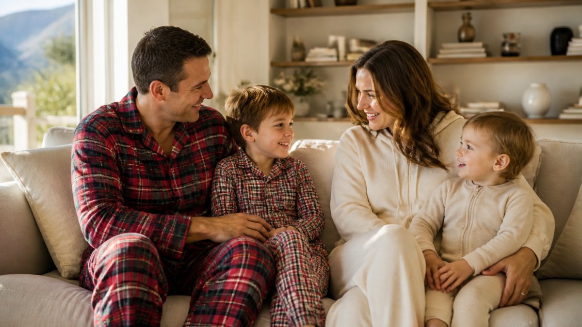
The eye needs a place to rest: one bold plaid gives the photo energy, and solids around it keep that energy from becoming visual clutter.
Try this breakdown for a family of four:
- Loud: one adult in a rich red-and-green plaid.
- Medium: one child in a smaller-scale plaid or a soft stripe.
- Quiet: one adult in solid cream.
The formula scales. For a family of six, add more quiet pieces, not more loud ones. For a family of three, drop the medium layer and keep one loud piece against two solids.
Combine Different Pattern Scales So Prints Don't Compete
Pattern scale is the size of the print relative to the garment. Small-scale patterns read as texture from a distance; large-scale patterns read as a statement. Two prints at the same scale compete; prints at different scales cooperate.
A simple scale guide:
| Scale | Reads As | Best Placed On |
|---|---|---|
| Small-scale | Texture, subtle detail | Kids, babies, accessories |
| Medium-scale | Balanced interest | One adult or older child |
| Large-scale | Bold statement | One adult, front and center |
Put the large-scale print on the person closest to the camera and small-scale prints on those further back. This keeps the photo from feeling flat.
How scale reads at different camera distances
The same print behaves differently depending on how much of the body fills the frame. A large buffalo check that looks bold full-body reads as busy mid-scale texture in a tight crop, while a small gingham that looks quiet full-body turns into visual noise in a close-up.
A practical rule: match the print scale to the crop.
- Full-body and group-wide shots: large-scale prints on one or two people, small-scale on the rest. The camera is far enough back that the big print reads as a single shape.
- Waist-up and three-quarter shots: medium-scale prints are safest. Large prints get cropped awkwardly at the frame edge; small prints turn into texture mush.
- Close-up and head-and-shoulders portraits: keep prints small and low-contrast, or switch to solids with texture. A bold plaid this close to the face pulls attention from eyes and expression.
If your session mixes full-body and close-up frames, most do, plan the loud print for whoever is most likely photographed full-body, and keep close-up subjects in quieter pieces.
How scale interacts with the background
- Busy outdoor settings (leafy parks, patterned brick, crowded streets): the background already has visual texture, so keep prints small-to-medium and low-contrast. A large, high-contrast plaid against a busy backdrop turns into camouflage.
- Plain studio walls and open fields: the background is quiet, so the family can carry more print. This is where one large-scale statement piece earns its keep.
- Strong horizontal or vertical lines in the background (fences, siding, railings): avoid prints with the same dominant direction. A bold horizontal stripe against a picket fence creates a moiré-like visual buzz.
How scale distributes across family size
The scale formula scales with the group.
- Family of two: one large-scale print, one solid or small-scale texture. Two bold prints in a two-person frame have nowhere to rest.
- Family of three: one large, one medium, one solid, the medium piece bridges the loud and quiet ends.
- Family of four to five: one large, one medium, two or three solids or small-scale textures.
Subtle, low-contrast prints are safest for group shots: a cream-and-tan check disappears gently into the frame, while a high-contrast black-and-white stripe shouts. When in doubt, drop one scale level smaller than you think you need, prints always read bolder in a photograph than in a mirror.
Pro Tip
Before the session, take a phone photo of the whole family from ten feet away, then crop it to a head-and-shoulders frame. If the prints still cooperate in the crop, they'll work in the final gallery.
Pair Contrasting Pattern Types: Stripes With Florals, Plaid With Dots
Contrasting pattern types work when they share a color: stripes and florals can sit side by side if both pull from the same palette, and plaid and polka dots can coexist for the same reason. The trick is contrast in shape, harmony in color. But "share a color" is where most guides stop, which is why families still end up with outfits that fight.
The three-test method for any pattern pairing
Before committing to two prints in the same frame, run all three tests. If a pairing fails any one, swap a piece.
Legacy Plaid Swaetshirt (Unisex) →
- The squint test. Step back ten feet and squint at the two garments together. If you can still tell them apart as distinct shapes, they contrast cleanly; if they blur into one busy mass, the scales are too close or the contrast too high.
- The shared-color test. Pull one color from print A and confirm it appears in print B. If the only shared color is white or black, the pairing relies on neutrals and will look accidental, not intentional.
- The third-piece test. Add the solid garment that will sit between the two prints in the photo. If the solid calms the pairing, it works; if it looks like it belongs to a different family, the prints are too far apart in tone.
Visual examples: what works and what doesn't
Fails: two large plaids in different colorways. Same scale, different palettes, the eye can't decide which is the anchor. This is the most common family-photo mistake.
Fails: bold stripe + bold geometric in the same scale. Both are high-contrast and linear, creating a visual buzz that reads as clutter even in a well-lit frame.
Fails: character or logo print + any other print. The character print already demands attention; a second print splits focus away from faces.
Pairings by session type
- Holiday and indoor sessions: plaid with polka dots, or plaid with a solid knit. Warm, festive, and forgiving under indoor lighting.
- Outdoor casual sessions: stripes with florals, or denim with any single print. Denim acts as a neutral and calms busy prints.
- Studio and neutral-backdrop sessions: one bold geometric with one small organic print. The plain background gives the prints room to breathe.
When to break the rules
Two situations let a pairing that fails the tests still work:
- When the two prints are on people at very different depths in the frame, a parent in the foreground and a child far back. Distance separates the prints visually, so the squint test passes even if it would fail side by side.
- When one print is mostly hidden, a scarf, a pocket lining, a rolled cuff. A small flash of a second print reads as a detail, not a competing pattern.
Outside those two cases, trust the tests: cooperating prints look intentional, competing prints look like everyone dressed in a different room.
Key Takeaway
The pairing rule in one line: contrast the shape, harmonize the color, separate the scale. If two prints share a color but differ in shape and scale, they'll almost always work together.
What Colors Look Good in Family Photos (and Which to Skip)
Soft neutrals and muted tones photograph best. Cream, oatmeal, denim blue, sage, and soft pastels flatter most skin tones and blend with most backgrounds.
Colors that tend to work:
- Neutral colors: cream, tan, gray, ivory.
- Soft pastels: blush, sage, powder blue.
- Deep accents: burgundy, forest green, navy.
Colors to skip or use sparingly:
- Neon shades, which blow out under bright light.
- Pure white against a pure white background, which erases body shape.
- Busy multi-color prints with no clear dominant hue.
Match your palette to your photo location. A forest green and cream scheme disappears into a pine backdrop.
For families who prefer a softer, less coordinated look, our plus-size family photo styling tips cover how to adapt palettes and proportions for every body.
Family Photo Outfit Ideas That Mix Patterns for Real Families
Real families have real constraints: different ages, sizes, and comfort needs. Here are outfit ideas built for that.
Idea 2: Denim base with one floral. Kids in florals, parents in denim and white.
Idea 3: Matching pajamas, mixed scales. The whole family in the same plaid family, but different piece types. Our guide to matching family pajamas for photo day covers comfort and fit for a long shoot.
Idea 4: Subtle prints only. Small-scale checks and soft stripes across the group.
Accessibility counts as well. Choose soft cotton blends with stretch so everyone can sit, kneel, and move.
Shop the Legacy Plaid Collection for Your Next Session
Our Legacy Plaid collection includes pieces for holiday outfit planning.
Start with the Legacy Plaid Henley Top for one adult.
Then add the Christmas Legacy Plaid Set for kids, a two-piece pajama set with soft cream ribbed trim.
Mixing patterns for family photos comes down to one habit: decide the palette before you decide the print.
Coordinates offers holiday-themed loungewear and an official University of Texas collection.
Frequently Asked Questions
Can you mix plaids in family photos?
Yes, as long as the plaids differ in scale and share a color thread. Put one large-scale plaid on an adult and a smaller-scale plaid on a child, then anchor both with solid cream, denim, or neutral pieces so the prints read as intentional rather than clashing. Avoid two identical large plaids side by side, which flatten the photo and hide each person's shape.
How many patterns should a family wear in family photos?
Aim for two or three patterned pieces across the whole group, with everyone else in solids. For a family of four, that means one adult in a bold plaid, one child in a subtle stripe or small print, and the remaining two in solid colors that pull from the palette. More than three competing prints creates visual clutter and pulls attention away from faces.
What colors don't look good on camera?
Pure white blows out under bright light and can wash out skin tones, while neon shades and tight fine stripes create camera moiré or color casts. Very dark head-to-toe black can lose detail in shadow. Safer picks are cream instead of white, soft pastels, muted jewel tones, and denim, all of which hold detail and keep the focus on faces in family portraits.
How do you balance patterned outfits with solid colors?
Use a 60-20-20 split: about 60 percent of the group in solid neutrals, 20 percent in a mid-tone solid or texture like linen or denim, and 20 percent in one or two patterns. This keeps the patterned pieces as accents rather than the whole picture, and it lets you add a plaid shirt or a printed dress without the group looking busy.


